AI Agents
Design Systems
Design Tokens


Built with Claude
7 min read
Design tokens that work in Figma, in code, and for AI agents

Most design systems die in the gap between Figma and code. The tokens live in a Figma file, the values get copy-pasted into CSS, and within a month the two have drifted apart. When I started building werkzux, the design system for AMDON products, I decided to close that gap first, before a single component existed.
This post is a step-by-step walkthrough of how I built the foundations layer: design tokens authored in Figma, shipped as an npm package that developers can install today, and structured so that AI coding agents can use them correctly without a human in the loop.
It’s ongoing work. The plan was deliberate: ship tokens and icons as versioned packages first, so product teams aren’t blocked waiting on a component library. Components come next, but they’ll be built on a foundation that’s already in production.
Step 1: Naming before anything else
Before touching Figma variables or writing a build script, I spent time on naming, because a token’s name is its API. Once developers start referencing --color-primary-background-strong, renaming it is a breaking change.
A talk on how Asana’s design systems team structures their tokens pushed me toward a strict, compositional grammar instead of ad-hoc names:
category:
neutral,primary,success,info,warning,dangerproperty:
text,background,border,iconvariant:
tint(quiet, tonal) orstrong(saturated, high-emphasis)state:
hover,active,disabled(omitted = resting)
The payoff of a grammar over a list: you can construct a valid token instead of looking one up. If you know the rules, danger-border-tint-hover just exists where you’d expect it to. This matters even more later, in the agentic section.
Two rules I held onto strictly: names describe intent, not appearance (primary, not violet), and names never change across themes or modes; only resolved values do.
Step 2: Author in Figma, structure in layers
The source of truth for design decisions is a Figma Foundations file, organized in two layers:
Primitives: raw palettes (the violets, stones, greens), authored as sRGB hex. These are internal; product UI never touches them.
Semantics: the tokens from the grammar above, each pointing at a primitive. This is the only layer consumers see.
The same file defines the numeric scales: spacing (0, 2, 4, 6, 8, 12 … 80), radius (0, 2, 4 … 32, full), a size-keyed type scale (12, 14, 16, 18, 20, 24, 30, 36, 40, 48, 60), and border widths. Closed sets, on purpose: there is no --spacing-10, and that’s a feature. Fewer valid values means fewer wrong choices.

Step 3: Convert the semantic layer to OKLCH
Here’s the decision that shaped everything downstream: in code, the semantic color layer is expressed in OKLCH, a perceptually uniform color space, while primitives stay hex.
Why bother? Because OKLCH makes theming math possible. In OKLCH, lightness actually means perceived lightness, so you can hold a token’s L value constant, swap its hue and chroma, and get a new theme where every contrast relationship still holds. Try that with hex and you get mud.
A hex-to-oklch script converts the Figma-authored values, so designers keep working in familiar hex while the system gets a color space it can compute with.

Step 4: Generate everything else, never hand-sync
werkzux ships to web and React Native, and RN has no CSS. The trap here is maintaining two token files by hand. Instead, the RN theme is generated from the OKLCH source:
Web gets CSS custom properties (
var(--color-primary-background-strong))RN gets typed JS objects (
t.colors.primary.backgroundStrong) viaThemeProvider/useTheme()The kebab-case CSS name and the camelCase JS name map 1:1
And because generated things still drift when someone edits the wrong file, npm run tokens:check verifies web↔RN parity in CI. Zero manual steps between the two platforms; that number is the whole point.

Step 5: Theming as orthogonal axes
Theming works through independent data-* attributes on <html>:
Theme family × light/dark × density × font family: four axes that combine freely, and token names never change across any of them. Re-theming an app is a data change, not a refactor.
The OKLCH investment pays off here. A new theme family is a recipe, not a hand-authored palette:
Two numbers. The build retints the neutral ramp (holding each role’s lightness so hierarchy and contrast are preserved) and copies primary and status hues through unchanged. Run tokens:build, and the theme exists on both platforms.
Why so many axes? Three products, and accessibility
AMDON has three products that share this one foundations package, and they don’t all look, or read, the same way. That’s what the font and density axes are for.
The font axis ships three families: Euclid Circular B as the default, SN Pro under data-font=”rounded” for a softer product personality, and OpenDyslexic3 under data-font=”dyslexia”, an accessibility mode for readers with dyslexia. Because every text style resolves through --font-headline / --font-body, switching the entire app’s typeface is one attribute, with no component changes.
The density axis does the same for spacing, radius, and type size: data-density=”small” and “large” remap the whole numeric scale (under large, --spacing-8 resolves to 12px). Larger density means bigger text and touch targets for users who need them, which is also why the system’s rule is to pick tokens by scale step, never by the pixels you expect.
Color contrast is handled by the OKLCH model itself. Since every theme holds each role’s lightness constant, the contrast relationships validated once for the base light and dark foundations carry through to every theme family automatically: accessibility isn’t re-checked per theme, it’s preserved by construction.
Step 6: Icons through the same pipeline
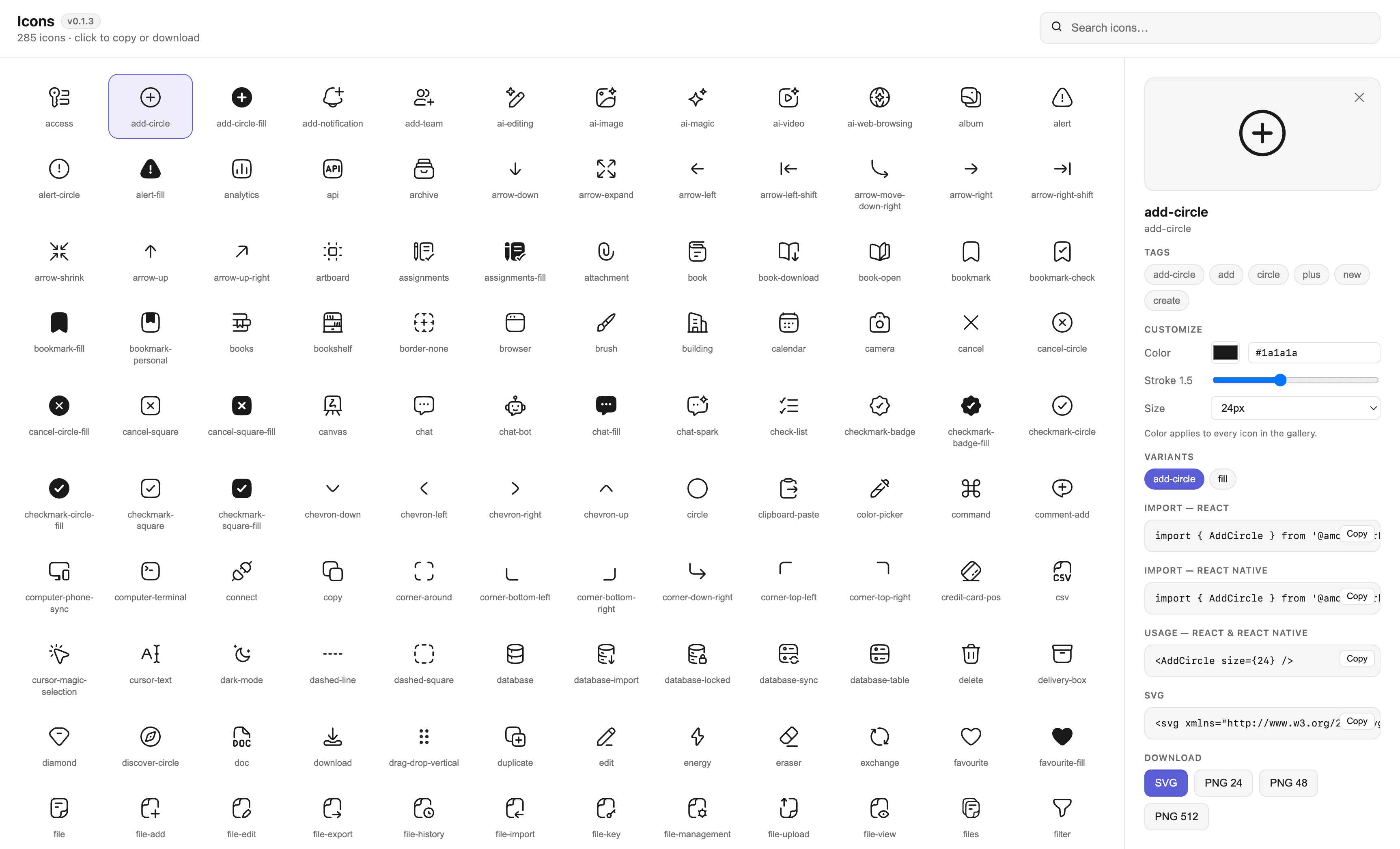
Tokens weren’t the only foundation. werkzux also ships 285 icons (a curated Hugeicons fork maintained in Figma), flowing through the same Figma-as-database model:
sync-iconspulls SVGs and metadata from the Figma file via the REST API into oneicons-source/directorybuild-iconsgenerates two packages from that single source: React SVG components for web (currentColor,1em) andreact-native-svgcomponents for RN
The part I’m most pleased with: search tags live in Figma component descriptions. Designers tag icons where they already work, and the pipeline extracts the tags into JSDoc on each component and a machine-readable icons.json shipped inside the packages. The model for this was Shopify Polaris’s icon explorer, where every icon is findable by concept, not just by name.
Those same tags power a live catalog at werkzux-icon.pagewerkz.com, searchable by name or tag, with copy-ready import snippets. It’s generated from the same manifest.json that feeds the packages, so it can’t drift from what’s published.
Step 7: Ship it like software
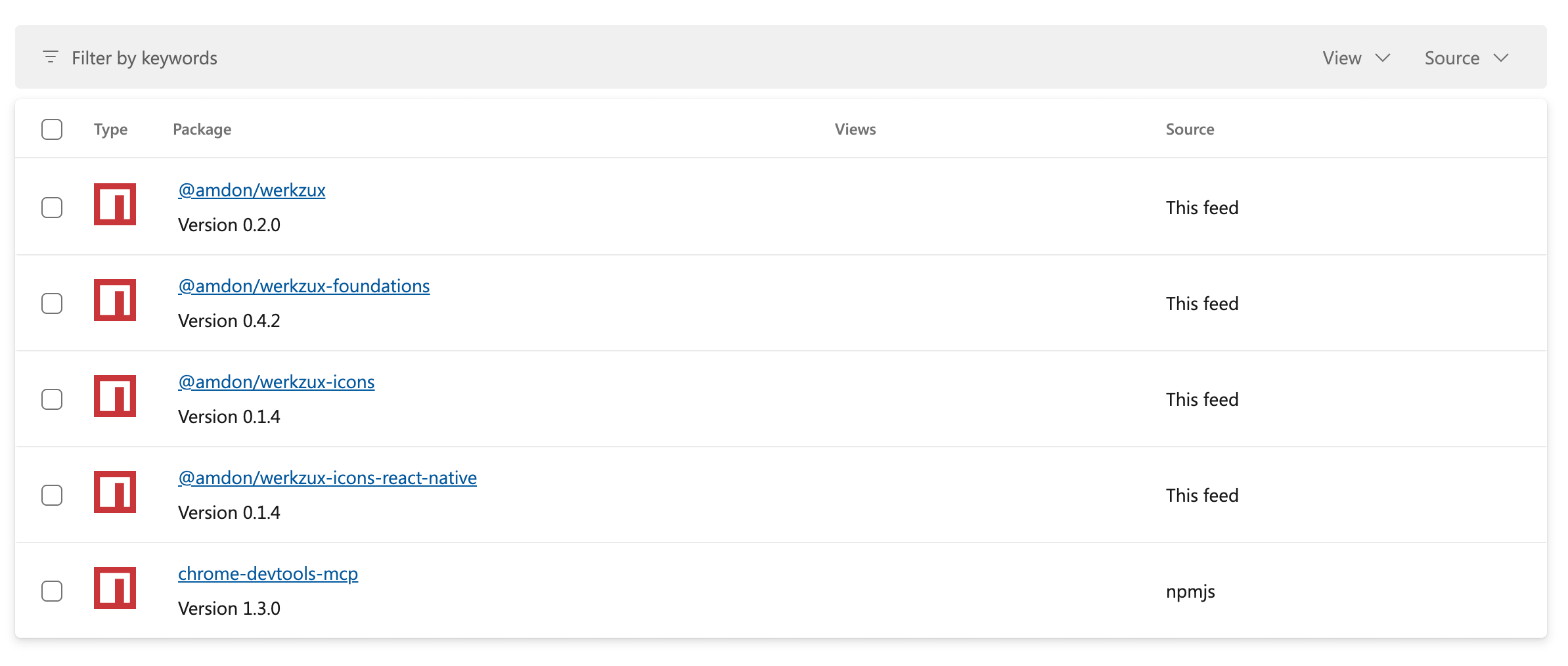
The whole thing is an npm-workspaces monorepo publishing three independently versioned packages to a private registry:
Package | What it ships |
|---|---|
| Tokens ( |
| 285 tree-shakeable React SVG icons (web) |
| The same 285 icons for React Native |
Versioning runs on Changesets (independent semver per package), releases go through a dedicated Azure pipeline, Chromatic runs visual regression on every PR, and Storybook documents every scale with copyable values. Consuming it is two lines:
Designing for agents, not just people
Here’s the part that changed how I think about design systems. Increasingly, the “developer” consuming these tokens is an AI coding agent, and agents fail in predictable ways: they hardcode hex values, they invent plausible-sounding tokens (--color-primary-500), and they can’t read your Storybook.
Three decisions make werkzux agent-legible:
The grammar is the guardrail. Because token names compose from a strict {category}-{property}-{variant}-{state} pattern with closed sets at every position, an agent can derive correct names, and anything outside the grammar is checkably invalid. A flat list of 200 creative names offers no such structure.
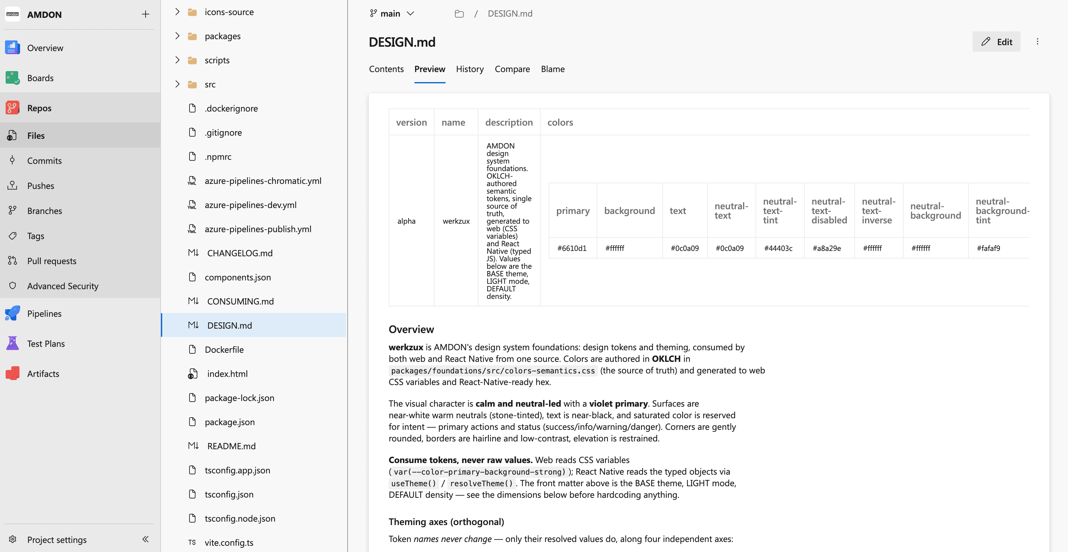
The rules ship inside the package. DESIGN.md, a written design-token contract with the full grammar, valid scale steps, pairing rules (“pair -strong fills with -text-inverse”), and explicit don’ts, is published inside @amdon/werkzux-foundations. When an agent works in a consuming repo, the documentation is already in node_modules, discoverable and current. It’s written to be dropped straight into an agent’s context.
Metadata is machine-readable. Icon tags in icons.json, typed exports, and a 1:1 CSS↔JS name mapping mean an agent can query the system programmatically instead of guessing.
None of this hurts human developers: the same properties that make a system predictable for an agent make it predictable for a person on their first day.

What’s next
This is the foundation, not the finish line. The roadmap, in order: harden the token packages in production use, grow the theme families (each one is two numbers now), and then build the component layer as a separate package, consuming these exact tokens by name, never forking values.
Shipping foundations first was the unlock. Product teams are using the tokens and icons today, components can arrive incrementally, and nobody is waiting on a dependency.
References: Design Tokens on Asana’s Design Systems Team (Jina Anne, Ainsley Wagoner, Ivy Wang, Schema 2021) for token naming, and the Shopify Polaris icon explorer for icon tagging and search.