TLDR;
Shipped a lean MVP, redesigned confusing setup flows, and helped teams scale support with smarter automation.
Designing a scalable AI support platform from 0 to 1 for medium to large business workflows
My Role
As a Product Designer, I built AeroChat’s MVP from scratch: from research and wireframes to UI and dev handoff. I also designed and developed a Framer website that explained the product and helped convert visitors into users. Over a year, I continued improving the product and helped launch a few new apps.
Team
Product Manager, Product Designer, Engineering Team
Services
Competitive Analysis, User Flow, Wireframes, User Research, Design Audit, Visual Design, Motion Design, Framer Development
Platform
Web Application
Mission
STRIDEC wanted to launch AeroChat: an AI chatbot that helps businesses answer customer questions using their own knowledge base, and connects channels like Messenger, Instagram, WhatsApp, Telegram, and website chat into one shared inbox. They needed an MVP and a marketing site to bring it to life.
Objectives and Challenges
The first step was understanding the team’s vision for AeroChat and aligning on core goals. The product was aimed at business owners and agencies managing client chatbots: people who needed a smarter, centralized way to handle conversations across platforms.
We defined a few key must-haves early on:
Connect multiple channels like Messenger, WhatsApp, Telegram, and more
Keep the knowledge base up to date with easy document uploads
Let users view and manage conversations across channels from one place
Enable human agents to take over chats when needed
Competitive Analysis
I conducted a competitive analysis of leading tools like Tidio, ManyChat, and Botsonic to identify common patterns, usability gaps, and key differentiators. This helped us understand what users expected and where competitors were falling short.
Unlike competitors that either lacked full channel coverage, made knowledge base setup overly complex, or didn’t support human takeover, AeroChat set out to be simpler and more adaptable. We focused on reducing friction in setup, making knowledge base creation more intuitive, and integrating messaging across both social and web platforms, all while giving business owners more control.
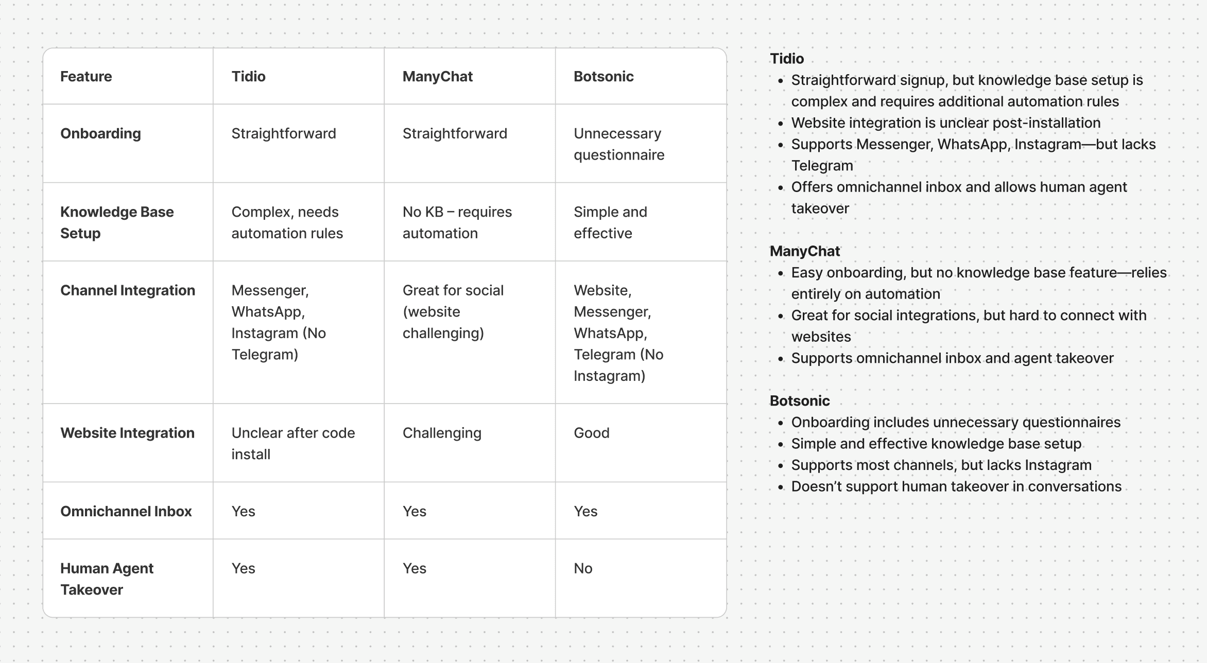
Key Insights from Tidio, ManyChat & Botsonic
User Flow
With the core objectives in place, I used insights from the competitive analysis to design a user flow that avoided the setup complexity seen in other tools.
I focused on helping users move from signup to a working chatbot smoothly, without requiring technical knowledge. The flow included key steps like account creation, onboarding, uploading a knowledge base, and connecting channels or website chat. Each step was designed to be simple, guided, and quick to complete.
To support execution and iteration, I mapped out the entire user flow, from registration to dashboard access, as a reference for design and development.
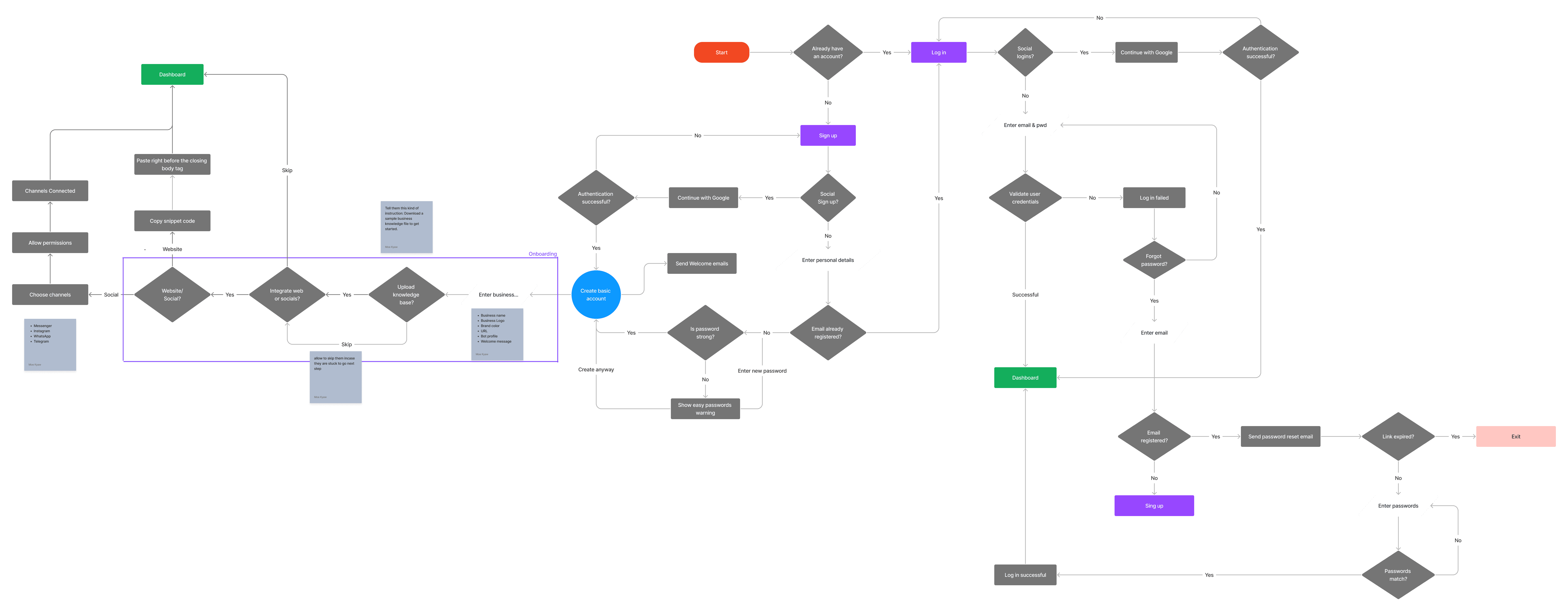
User flow diagram
Wireframes
Once the user flow was in place, I moved on to wireframing key screens. The goal at this stage was to explore layout ideas quickly and validate the experience across different use cases—without getting caught up in visual design too early.
I focused on information clarity, reducing cognitive load, and making each step in the setup feel approachable. This helped me spot gaps in navigation, identify redundant steps, and get early alignment before moving into UI design.
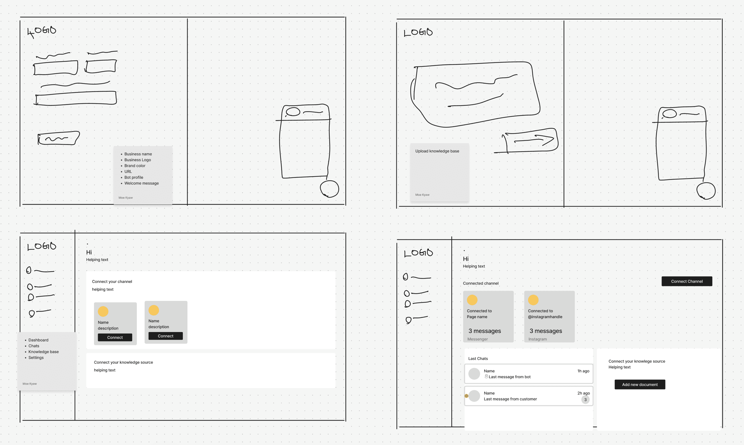
Wireframe
UI Design
Once the wireframes were in place, I moved on to high-fidelity UI design. I defined AeroChat’s visual language: clean, modern, and easy to scan across multiple message types and channels.
The UI focused on clarity and control: a left-side menu for quick access to chats, knowledge base, channels, and settings; a main view tailored for managing multi-channel conversations; and lightweight visual cues to distinguish AI responses from human replies.
I also established reusable components and patterns early on, making future iterations faster and more consistent across the app.
Component library overview
Some interfaces for MVP
Email Template Design
Alongside the UI, I designed a full set of branded, responsive email templates that supported all major flows from account sign-up and onboarding to automated alerts customer messages, invoicing, and plan upgrades. Each template followed AeroChat’s visual language and was optimized for clarity, consistency, and mobile responsiveness. These templates helped the team maintain a cohesive experience across the product without added design or development effort. Key emails like alerts when a customer asked for human help allowed business owners to stay informed without constantly monitoring the dashboard.
Email Templates
Marketing Website
Once the core product was underway, I shifted focus toward improving AeroChat’s marketing site. The team already had a live WordPress site, but it lacked visual consistency, wasn’t fully mobile responsive, and suffered from slow load times. Together with my PM, we restructured the site’s hierarchy to improve clarity, trust, and readability across devices.
As with the app, we refined the visual design to align more closely with AeroChat’s brand. To address performance and maintainability, I rebuilt the site in Framer, which noticeably improved load times (by an estimated 30–40%) and fixed mobile responsiveness. Framer made it easy for the team to update content and visuals without relying on engineers, enabling faster iteration across product launches.
We also implemented basic SEO best practices: structured headings, alt text, semantic HTML, to improve organic visibility over time. As AeroChat evolved, the marketing site remained fast, easy to manage, and consistently aligned with the product’s UX and brand direction.
Before - WordPress Version
Drag up and down to view the full page
After - Redesigned in Framer
Drag up and down to view the full page
Help & Onboarding Content
To support adoption and reduce friction, I created a full set of channel integration guides: both as written tutorials and narrated videos. These covered how to connect AeroChat to platforms like Messenger, Telegram, WhatsApp, and more. I used AI-generated voiceovers to speed up production while keeping the experience professional and clear.
In addition, I produced a step-by-step onboarding video that walked new users through setting up their account, uploading a knowledge base, and getting their first bot live. These resources helped reduce support tickets and gave users the confidence to set up AeroChat without external help.
UX Improvements & Redesign
After launch, we conducted a UX audit and spoke with several business owners using AeroChat. Their feedback surfaced recurring issues across key flows: especially around onboarding, chat clarity, and team management. Based on this, we made several targeted improvements:
Problem
After signing up, many users didn’t know what to do next. The bot’s customizability wasn’t obvious, and key settings—like welcome message, fallback message or bot/human avatars weren’t clearly surfaced during onboarding, which made the setup feel incomplete.
Most business owners also didn’t understand what a knowledge base was or what kind of content to upload. The term felt too technical, and the lack of examples led to hesitation and drop-off.
Even after completing the setup, users had no way to test whether their bot was working as expected, which made the experience feel uncertain and unsupported.
Solution
We redesigned the bot settings page and placed it within the onboarding flow, ensuring that welcome message, fallback message and avatars were clearly visible and easy to set up from the start.
To reduce confusion around content creation, we renamed knowledge base to Business Knowledge, and added a built-in editor with structured templates to help users write content like FAQs and service info more easily.
To give users immediate feedback and confidence, we introduced a “Test Your Bot” page, always accessible, where users could interact with their chatbot at any point and preview how it responds. We also generated sample questions to help them evaluate the bot’s behavior even before adding any content.
We added connection status indicators for web chat installation, showing if the widget was active and which domain it was connected to.
Problem
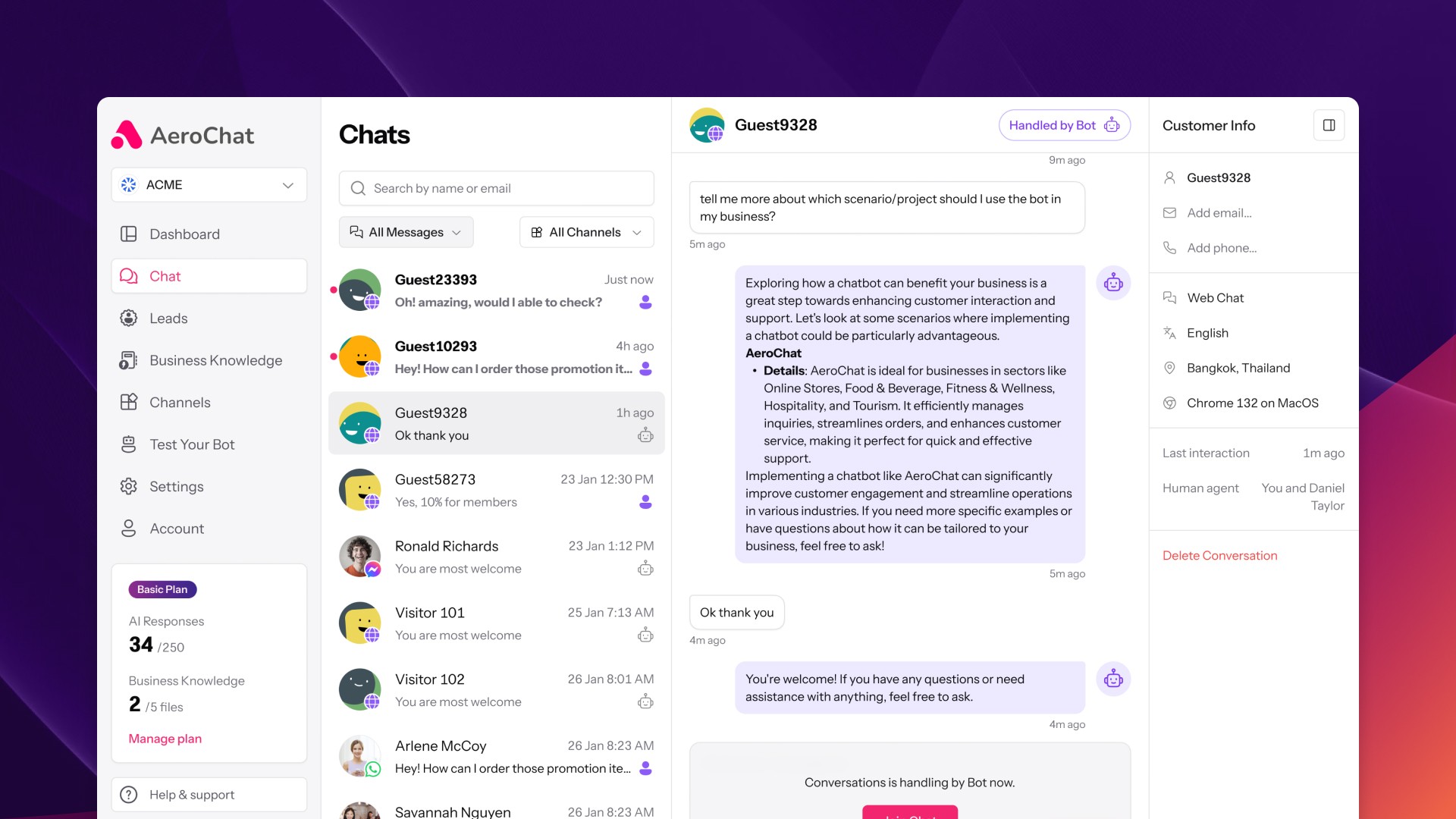
While business owners could generally tell whether conversations were handled by a bot or a human, the visual indicators weren’t distinctive enough, even inside specific chat threads. This made it harder to quickly scan and manage ongoing interactions.
The human takeover flow also caused confusion. Once a human agent took over, it wasn’t clear whether the bot was still active in the background or if the conversation had been fully handed off, leading to hesitation or missed replies.
In cases where the AI response wasn’t satisfactory, business owners had no idea a customer was stuck or waiting for further help, since no alerts or cues were in place to flag frustration or handoff requests.
Business owners also requested the ability to edit customer contact details (email and phone number) and to make edits to human agent messages after they were sent, especially for follow-up corrections or clarifications.
Solution
We improved visual clarity in chat threads by updating the styling of bot vs human messages, making the distinction more obvious at a glance. To address the confusion around human takeover, we introduced clearer UI feedback showing the current status of the conversation—whether it's managed by a bot or actively handled by a human agent.
To solve the stuck conversation issue, we implemented a backend logic that triggers an email alert to the business owner whenever a customer requests human help or reacts negatively to a bot response, helping them step in without needing constant monitoring.
We also added support for editing a customer's email or phone number within the chat, giving business owners better control over lead data. Lastly, we enabled sent message editing for human agent replies, helping teams maintain clarity and correct small mistakes without breaking context.
Problem
Business owners needed better control when inviting teammates, especially when assigning different roles. The invite flow also caused confusion and missed access.
Solution
We introduced permissions, allowing owners to assign roles with specific access levels. The invitation process was also redesigned to be clearer and more reliable.
Command Center
To help business owners stay on top of their support performance, I designed a clean, glanceable dashboard that surfaces key metrics like pending replies, new leads, and AI engagement.
It also tracks customer sentiment, based on conversations between the AI and customers, to give teams a quick read on how interactions are going. Another useful insight is conversion link clicks, which monitor how often users click on product or support links suggested by the AI during conversations, helping teams evaluate what content drives action.
Dashboard page
After launching the redesigned onboarding, chat, and team management experiences, alongside improvements to the marketing site and help content, we saw meaningful improvements in setup completion, feature adoption, and engagement with support resources.
30–40%
Reduction in marketing site load time after switching from WordPress to Framer
+38%
Increase in onboarding completion rate after restructuring the setup flow and surfacing key settings
+63%
Of users interacted with “Test Your Bot” during their first session
2× faster
Average setup speed after renaming Knowledge Base and adding guided templates
2,500+
Views on YouTube integration tutorials, making it our most engaged help resource
The biggest challenge in this project was making complex AI chatbot features feel approachable for non-technical users. As the sole designer, I had to strike a balance between product flexibility and guided simplicity so that business owners could set up and trust the system without external help.
One key lesson was the importance of designing with real user behavior in mind. Small UX shifts like renaming “Knowledge Base,” surfacing overlooked settings, and giving users a way to test their bot, had a major impact on clarity and confidence. Just as importantly, collaboration with engineering helped us solve problems beyond the UI: for example, adding backend logic that triggers alerts when users get stuck, so business owners can step in without constant monitoring.
This project reminded me that thoughtful, user-centered decisions: both visual and behind the scenes can make a product feel smarter, faster, and more trustworthy.
Thanks for making it all the way to the end of this case study. I hope it gave you a clear look into my thinking, process, and the design decisions behind AeroChat.